Report Designer
The Report Designer is a highly powerful tool that is used in creating Directories and Custom Reports. The standard report options for Basic reports are usually sufficient, so before using this tool, make sure there is not already a Reports / Directory / Exports layout that will suit your needs.
The Report Designer allows you to create totally custom reports and directories from scratch or make your own unique changes to the default templates included with the software. This tool lets you change the intricate details of each field on your report: size, position, separators, headers and footers, etc. This is a very involved tool and usually only used by those very familiar with customization and designing that have specific requirements.
From the Step 2 — Select the report layout/format screen, choose either Directory or Custom and select a template that you would like to modify from the dropdown menu and click Edit or click the New button to start from scratch. The default layouts that come with Church Windows will all say [Template] and then the name of the layout. These templates cannot be modified or replaced, however they can be used as a starting point as long as you enter a new name when you save the layout. Any layout that you modify or create cannot have [Template] before the name of the layout. Clicking either will bring you to the Report Designer screen:
How to Use the Report Designer
 Step-by-Step
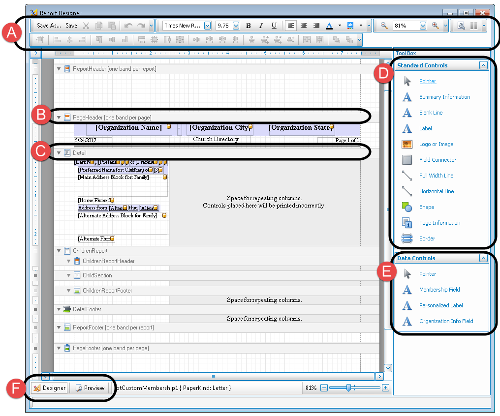
The following provide you with the basic overall steps to use the Report Designer. The instructions break down the contents of this screen into six primary sections corresponding to the labels in the image above.
- Click an item from the (D) Standard Controls or the (E) Data Controls.
- Choose whether you are putting the item in the (B) Report and Page Headers or the (C) Detail section.
- For the item that you chose from (D or E), click and drag the mouse button into the area chosen — (B) or (C). This will trace the perimeter of the item you chose in (D or E)and add it to the form.
- Click a desired option from the (A) Format Toolbar to format the appearance, size, and other characteristics of item added to the form.
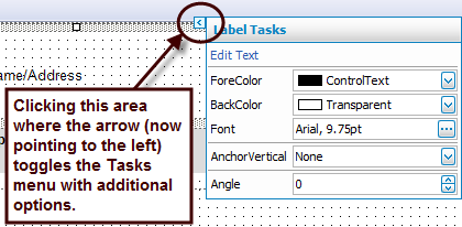
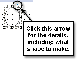
- For more tasks, click the arrow button on the selected item, as shown in the image below:
Note:
In the image above, the arrow points to the left. When the item is selected, this arrow points to the right and the task menu does not show. Click the arrow, however, and you will get a menu like the one above to appear. This menu lets you apply characteristics that are only specific to the item selected on the form. - Repeat Steps 4 and 5 until you are satisfied with the appearance of the object. At any time, you can move the object around and change its size. You can also press the (F) Designer / Preview button in the lower left corner of the screen to see a demonstration with sample data of how the item(s) added to the form will appear.
- Continue adding new items from (D or E) repeating Steps 1 through 5 until you have included everything you need.
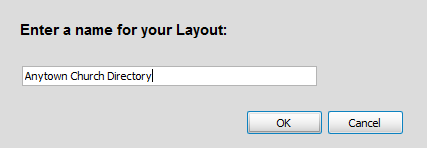
- Finally, when you are finished, press the Save As button at the top of the screen.
- Enter a name that you would like your form to have and press the OK button:
- Exit out of Report Designer. Your new layout will be ready for you to use.
- Once you have made all of your selections, click Print to view a Print Preview and then proceed in sending the file to your printer. You can also Export most reports and/or Send via Email as a file to be used outside of Church Windows.
- Continue to Directory / Custom Reports for a detailed example.
Note:
To move objects very precisely, you can hold down the CTRL key and use the arrow keys on your keyboard (←, ↑, →, or ↓) to move the object(s) very minutely. You can also hold the SHIFT key along with CTRL and the use arrow keys to either stretch or shrink the size of the object(s).
Note:
When naming a new report layout, keep in mind that you are creating a template which can be used for other reports with different data in the future, therefore names should NOT include specific dates or the search criteria you used to compile the report. Instead, the name should indicate what kind of information will be included in the report.
Primary Sections
-
Format Toolbar
The two toolbars at the top of the screen allow you to save the layout under a specific name and adjust the font size, font style, text alignment, as well as zooming further in and further out. Below is a complete list of the items from left to right, starting with the Top Toolbar and ending with the Bottom Toolbar. Both toolbars are separated into their own groups:
Top Toolbar
Bottom Toolbar
After having clicked on a control from the Standard Controls and having placed the control on the form, you can use any of the following buttons to apply formatting to the control. Eight of the twenty five controls on this list can be used with at least one control. These controls have been marked in the list below with an (*) asterisk.
To use any of the rest of the controls on the Bottom Toolbar, you must first select at least two controls that have been already added to the form. To Grid (*)
Align the positions of the selected controls to the grid.
 Lefts
LeftsLeft align the selected controls.
 Centers
Align the centers of the selected controls vertically.
 Rights
Right align the selected controls.
 Tops
TopsAlign the tops of the selected controls.
 Middles
Align the centers of the selected controls horizontally.
 Bottoms
Align the bottoms of the selected controls.
 Width
WidthMake the selected controls have the same width.
 Size to Grid (*)
Size the selected controls to the grid.
 Height
Make the selected controls have the same height.
 Both
BothMake the selected controls the same size.
 Make Equal
Make the spacing between the selected controls equal.
 Increase
Increase the spacing between the selected controls.
 Decrease
Decrease the spacing between the selected controls.
 Remove
Remove the spacing between the selected controls.
 Make Equal
Make the spacing between the selected controls equal.
 Increase
Increase the spacing between the selected controls.
 Decrease
Decrease the spacing between the selected controls.
 Remove
Remove the spacing between the selected controls.
 Horizontally (*)
Horizontally center the selected controls within a band.
 Vertically (*)
Vertically center the selected controls within a band.
 Bring To Front (*)
Bring the selected controls to the front.
 Send To Back (*)
Move the selected controls to the back.
-
Report and Page Headers
Any of the items you place in the Page Header will appear at the very top of the paper on every page of your report and any items you place in the Report Header will appear at the top of the first page of your report.
-
Detail
Any of the items you place in this area will appear in the center of the paper that you have set aside to print reports.
-
Standard Controls
When any item from the list below is selected, you can place it anywhere in the Detail and/or Report and Page Headers section(s).
Note:
When you first enter the screen, the pointer object in the Standard Controls will appear as
  underlined. This is an example of what indicates the object as active and ready for you to use. And when you click a different item, that new item will then contain the line underneath it.
The following is an alphabetical list of all the fields inside the Standard Controls toolbox:
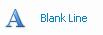
The Blank Line will insert a blank line the height of a row of text in your report.
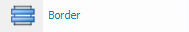
The Border object is a square that you can use to surround any items you wish to enclose.
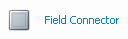
Field Connectors are the bluish colored fields that take care of the line spacing.
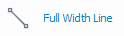
The Full Width Line will make a line across the full width of the page within the margins extending from left to right.
The Horizontal Line object represents a straight line that you can draw on the form that extends from left to right, and vice-versa.

The Label field represents a blank area that is available for any text that you would like to enter and have appear on every statement or invoice that uses the layout you are adjusting with the Report Designer. Sometimes, you can use this to enter a few set spaces between objects and fields. While at other times, you can enter text of your choice.
The Logo or Image field is an object that lets you determine a place on the Report Designer layout to add a picture or design found on your hard drive. For example, if you would like to add a logo that your organization prints on most of its brochures, bulletins, etc, you can also add it onto your statements and invoices.
To do this, however, your computer must have access to the logo, which must have already been created. Then, you can use the software to position it on the Report Designer layout.
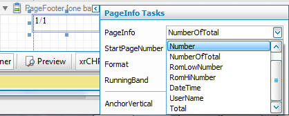
The Page Information field is an automatically populated field that inserts information based on the selection made in the tasks menu for that object. The choices are as follows:

The Pointer object is to be selected only for when you would like to move any object or field to any desired place on the Report Designer layout.
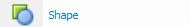
The Shape object represents any symmetrical object that you wish to add to the form. Some of the available shapes include an ellipse, a circle, a pentagon, a hexagon, etc, which are available once the shape is added to the form.
First, click the Shape item from the list, then add it to the form. Once you add it to the form, click the arrow for additional details on the shape:
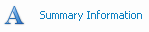
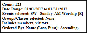
The Summary Information will insert the search criteria used for the report as well as a count of the number of people included on the report, for example:
Note:
This field can only be placed in either the Report Header or Report Footer.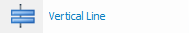
The Vertical Line object represents a straight line that you can draw on the form that extends from top to bottom, and vice-versa.
-
Data Controls
When any item from the list below is selected, you can place it anywhere in the Detail and/or Report and Page Headers section(s). The following is an alphabetical list of all the fields inside the Data Controls toolbox:
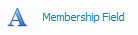
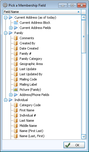
These fields are used to add any field from the Membership Module to your reports. When you drag and drop the field into the form, a window will open allowing you to select any Family or Individual field to insert. Press the + to the left of each category of fields to expand the list of fields and make your selection:
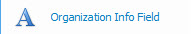
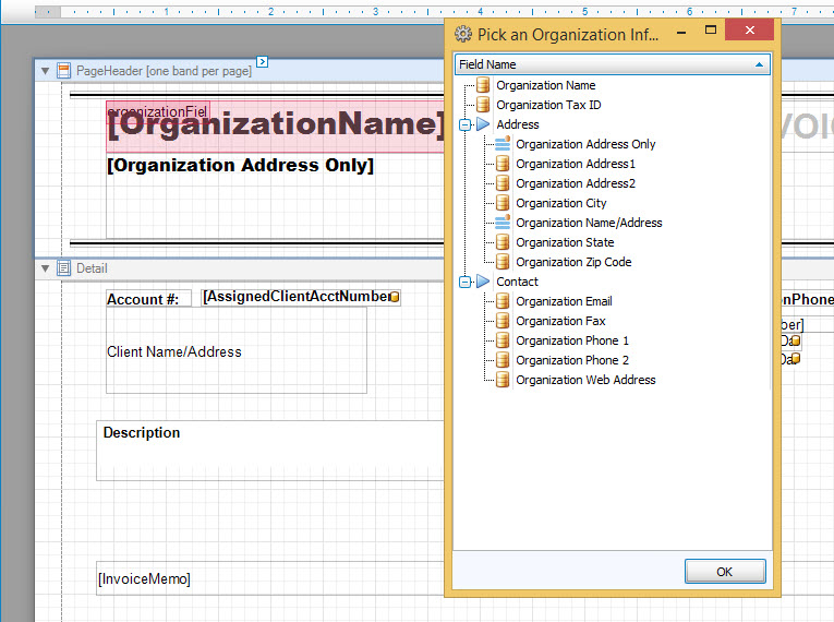
The Organization Info field will allow you to further customize the Organization Info. Here, you can drag and drop the Organization Info field from the right, and when you let go of the mouse button, you can further customize which organization info fields and where you want them:
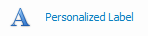
These are special labels which will automatically add the name of the family member along with whatever label text you type, for example Bob's Cell or Susan's Email. The label will add the person's name and 's before the text that you have entered using the label tasks pop-out menu:
The Pointer object is to be selected only for when you would like to move any object or field to any desired place on the Report Designer layout.
-
Designer / Preview
- Click the Designer button
 to make any adjustments to the fields on the layout (as explained above).
 - Click the Preview button
 to view how the layout items would look if printed out.
Note:
The Preview will display the layout using demo data, not your Church's data. - Click the Designer button


 dropdown button and make a choice from this box. Fonts that you can use to change the style in which the text appears for your item selected can be chosen from this box.


 radio button.